

Microsoft's ongoing visual evolution within Windows 11 has recently brought the Task Manager icon under the microscope, stirring considerable discussion among technology enthusiasts and design observers. This review delves into the criticisms surrounding the updated icon, contrasting it with its predecessors and examining the broader implications of modern interface design choices.
The Evolving Face of Windows: Task Manager Icon Under Scrutiny
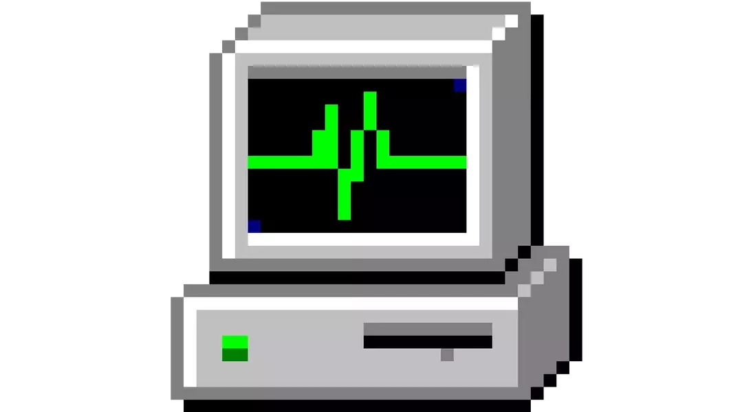
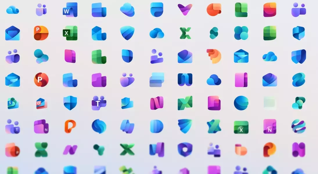
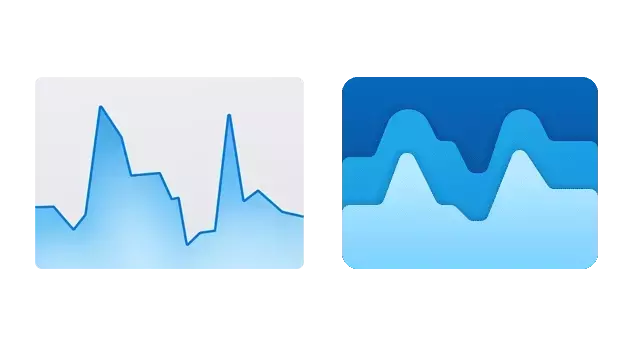
In a recent software update, Microsoft quietly altered the Task Manager icon in Windows 11, a move that has not gone unnoticed. Previously characterized by a clear, functional line graph symbolizing CPU performance, the new design features a more abstract, layered blue waveform. This shift, according to critics, diminishes the icon's immediate clarity and connection to its core function. The change mirrors a larger trend within Microsoft's design language, particularly evident in its Office suite, where application icons are transitioning towards more abstract, color-centric representations for cohesive branding. While modern in appearance, these designs sometimes sacrifice the instant recognizability that older, more literal icons offered. The author expresses a particular fondness for the original Task Manager icon from the Windows 2000 and XP eras, praising its elegant simplicity and intuitive depiction of system activity. This earlier icon, resembling a heart monitor for a PC, communicated its purpose effectively through efficient pixel use. The current design, however, is perceived as a departure from this user-centric clarity, leading to a less intuitive and potentially confusing user experience.
This discussion around the Task Manager icon extends beyond mere aesthetics, touching upon the fundamental principles of user interface and user experience (UI/UX) design. While striving for a unified visual identity across an operating system is a commendable goal, designers must carefully balance this with the need for clear, functional communication. The ideal icon should not only be visually appealing but also immediately convey its purpose, minimizing cognitive load for the user. As operating systems continue to evolve, particularly with the integration of AI and more complex functionalities, maintaining this balance will be crucial for user satisfaction and overall system usability. The ongoing debate serves as a reminder that even the smallest design choices can have a significant impact on how users interact with technology.
