This discussion critically examines the varying artistic approaches taken for the Wii Sports Resort game covers across different geographical markets. The North American design emphasizes a direct presentation of the new sports included, aiming for clarity and immediate information. In contrast, the European and Japanese rendition adopts a more unified and atmospheric visual, focusing on the immersive experience of Wuhu Island. This comparison highlights how cultural and marketing considerations influence the visual representation of video games, inviting enthusiasts to weigh the effectiveness of each artistic choice.
North American Box Art: Function Over Form
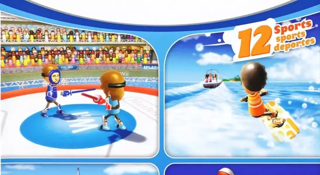
The North American box art for Wii Sports Resort distinctly prioritizes a functional approach, clearly showcasing the game's new features. This design segments the cover into four distinct panels, each dedicated to a new sport: Swordplay, Wakeboarding, Archery, and Basketball. The intent behind this layout is to immediately inform potential players about the fresh activities available in this sequel. While this method is undeniably straightforward and direct, effectively communicating the game's expanded content, some might find it lacks a certain artistic flair or cohesive visual appeal. Its emphasis on individual sports, rather than a unified theme, presents a clear, almost instructional overview of what's new.
This particular design choice for the North American market leans heavily into explicit communication. By isolating each new sport within its own quadrant, the cover acts as a quick visual summary, allowing consumers to grasp the core additions without needing to read detailed descriptions. This approach is highly effective for a market that often values directness and clarity in product presentation. However, this fragmented visual might detract from the overall sense of adventure or resort-like atmosphere that the game aims to convey. The design, while informative, could be perceived as less imaginative, offering a pragmatic overview rather than an evocative invitation to the vibrant world of Wuhu Island.
European and Japanese Box Art: Artistic Immersion
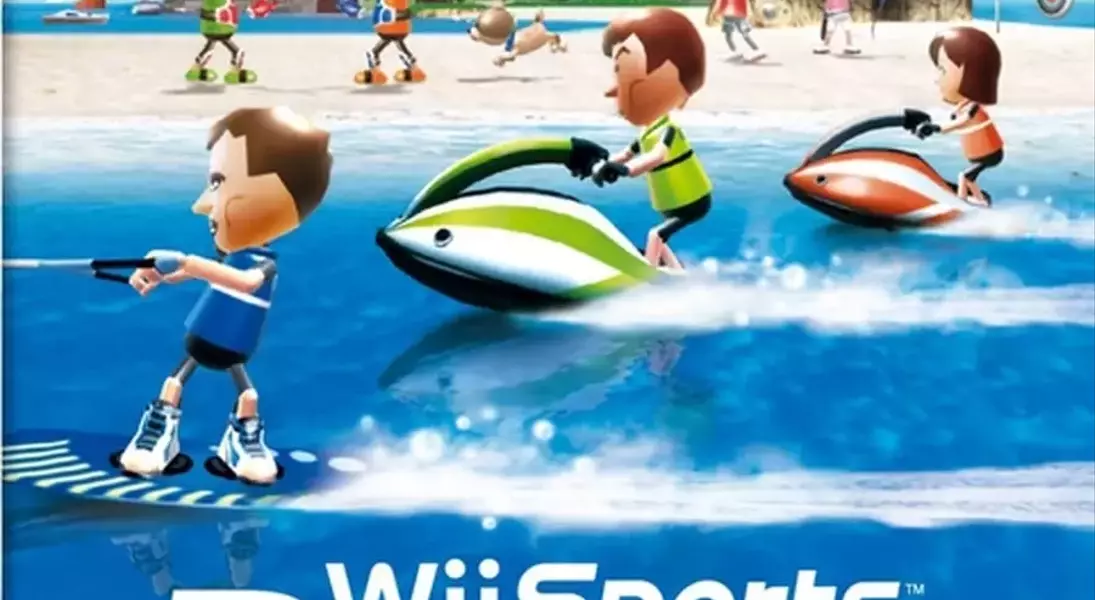
In stark contrast, the European and Japanese box art for Wii Sports Resort embraces a more artistic and immersive design philosophy. This version presents a single, cohesive illustration that elegantly blends various new water sports in the foreground with beach activities subtly hinted at in the background. The design prioritizes creating an inviting and adventurous atmosphere, aiming to draw players into the vibrant world of Wuhu Island. While it might not explicitly detail every new sport as clearly as its North American counterpart, its overarching goal is to convey the spirit of exploration and leisure that defines the game, encouraging a sense of anticipation and discovery through its rich, unified visual narrative.
This unified artistic approach effectively creates a sense of place and mood, rather than just listing features. The full-box illustration invites viewers into the idyllic setting of Wuhu Island, emphasizing the immersive experience of the game. The foreground's focus on water sports like wakeboarding and jet skiing immediately establishes the game's tropical resort theme, while the background hints at other varied activities without explicitly detailing them. This design relies on visual storytelling and emotional connection, suggesting a broader, more integrated gameplay experience. It communicates the essence of a holiday destination filled with diverse activities, subtly inviting players to explore the island and its offerings through a visually appealing and cohesive piece of art.