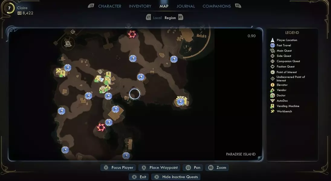
While the overall experience of 'The Outer Worlds 2' has been largely positive, a significant point of contention arises from its poorly designed in-game map. Despite the convenience of a functional minimap and custom waypoints, the main map screen presents numerous usability challenges. Issues include the uniform coloring of various icons, making it difficult to distinguish between different points of interest, and the tendency for crucial NPC waypoints to become almost invisible, particularly when overlaid with other map elements. These shortcomings detract from an otherwise engaging gameplay experience, often turning simple navigation into a frustrating endeavor.
The primary grievances stem from the map's lack of visual distinction among different icons. Fast-travel points are clearly marked in blue, but essential markers for waypoints, vendors, and workbenches all share the same yellow hue. This uniformity creates confusion, as tracking a specific quest does not alter its waypoint's color, only providing a subtle, often unnoticeable, pulsing animation. While initial quest waypoints might be discernible upon entering a new area, the complexity escalates rapidly as more icons populate the screen.
A particularly vexing issue emerges when quests necessitate interaction with non-player characters. Even for pivotal main story missions, the corresponding NPC waypoint on the map screen shrinks to an almost imperceptible size. To exacerbate this problem, these minuscule waypoints are frequently obscured by larger icons representing fast-travel locations, vendors, and workbenches, especially when viewing the map at its default zoom level. This design flaw compels players to painstakingly zoom in and pan across the map, akin to searching for a needle in a haystack, merely to locate their next objective.
Although players often retain a general memory of an NPC's location, and the minimap provides directional guidance, the lack of a clear, prominent waypoint on the main map poses a significant obstacle, particularly when seeking the nearest fast-travel point to cover long distances. This issue is compounded if players take a break from the game and forget specific NPC whereabouts. Relying solely on the minimap for a 700-meter trek is inefficient, making a clear, easily identifiable waypoint for NPCs crucial for optimizing travel and maintaining player engagement.
Addressing these map-related frustrations would require straightforward modifications. Designers could easily enhance the map's clarity by making NPC waypoints the same size as other quest icons, ensuring selected quest waypoints remain visible regardless of other overlaying elements, or simply assigning a distinct color to them for better differentiation. Given the player character's advanced tools—such as a gun capable of making bodies vanish, a mask revealing circuitry, and a time-slowing device—it seems reasonable to expect a similarly sophisticated and functional navigation system.
