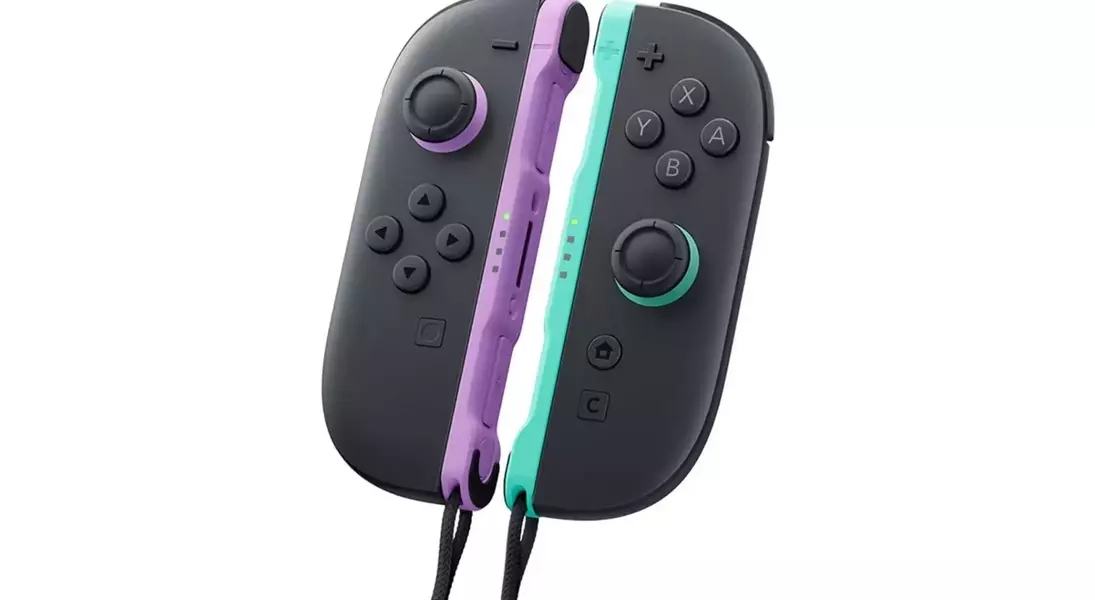
Nintendo's recent introduction of new Joy-Con 2 colors for the Switch 2 marks a subtle yet significant shift in their accessory design philosophy. Unlike the original Switch, where Joy-Cons often served as vibrant fashion statements, the new light purple and green options present a more understated aesthetic. This change, coupled with the premium price point, invites players to re-evaluate the utility and visual impact of these new peripherals, moving away from the previous culture of collecting diverse color combinations.
This evolution in design is not merely superficial; it reflects a broader consideration of how players interact with their consoles. While the original Switch fostered a sense of personalization through its highly visible, interchangeable Joy-Cons, the Switch 2 appears to prioritize a more integrated and perhaps sophisticated look. The reduced visibility of the new colors when attached to the console subtly nudges players towards appreciating functionality over flamboyant display, prompting a deeper thought process on the perceived value of these new accessory choices.
Subtle Aesthetics and Value Proposition
Nintendo has released new light purple and green Joy-Con 2 controllers for the Switch 2, priced at $99.99. A notable design change is that these new colors are predominantly on the interior of the controllers, meaning they are barely visible when attached to the console. This design decision offers a sleek, modern aesthetic but contrasts sharply with the original Switch's vibrant, highly customizable Joy-Cons. Players are left to ponder the value of purchasing these new color options when their visual impact during normal gameplay is minimal, especially considering the higher cost.
The price point of $99.99 for the new Joy-Con 2 controllers, coupled with their less prominent coloring when docked or attached, prompts a critical assessment of their value. While the design aims for a sophisticated look, it deviates from the previous model's emphasis on personalization and collectible aesthetics. This change suggests a shift in Nintendo's strategy, moving away from encouraging a wide array of brightly colored accessories. The limited visual differentiation means that for most players, the new colors offer little more than a "suggestion" of color, making the investment questionable unless a replacement is genuinely needed or the controllers are frequently used in detached, multiplayer scenarios where their colors are more noticeable.
Shifting Design Philosophy and Player Engagement
The updated Joy-Con 2 design, with its subdued color integration, signifies a departure from the "fashion statement" culture that surrounded the original Switch's Joy-Cons. While the previous generation encouraged collecting various vibrant hues and mixing-and-matching, the Switch 2's more uniform appearance may reduce the incentive for players to acquire multiple sets solely for aesthetic purposes. This design choice, though subtle, could influence player engagement with accessories, shifting focus from visual customization to other aspects of the gaming experience.
This aesthetic shift has implications for how players will engage with their Switch 2 accessories. The original Switch's Joy-Cons were often seen as an extension of personal style, fostering a community around collecting and showcasing different color combinations. By making the new Joy-Con 2 colors less visible during typical usage, Nintendo appears to be moving towards a more standardized console appearance. This might mean fewer players investing in new Joy-Cons purely for their visual appeal, instead reserving purchases for functional replacements or specific multiplayer needs. The change represents a move away from the "collectible" aspect that defined the original Joy-Con market, potentially impacting long-term accessory sales and player customization habits.
