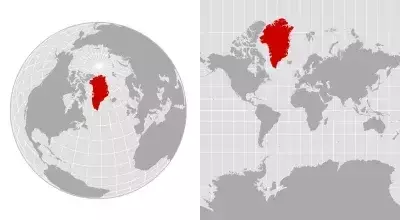
Our understanding of global geography is profoundly influenced by the maps we encounter daily, yet these flat representations often present a distorted view of reality. The challenge of translating a three-dimensional sphere onto a two-dimensional plane inevitably leads to inaccuracies, particularly concerning the relative sizes of continents and landmasses. This cartographic conundrum has led to persistent misconceptions about the true scale of regions like Greenland, the world's largest island.
Unveiling Greenland's True Proportions: A Look at Map Projections
The discussion around Greenland's perceived size versus its actual area gained renewed attention following former President Trump's contemplation of acquiring the island. Despite its considerable strategic importance, Greenland's colossal appearance on many conventional maps can be misleading. While it spans over 836,000 square miles, making it an undeniable giant among islands, its portrayal on a widely used Mercator projection significantly exaggerates its magnitude.
Dating back to the 16th century, the Mercator projection was a revolutionary tool for navigation. Its brilliance lay in its ability to depict lines of constant compass bearing as straight lines, greatly assisting sailors in charting courses. However, this convenience came at a cost: a progressive distortion of landmass sizes as one moves away from the equator towards the poles. This is why Greenland often appears comparable in size to the entire continent of Africa on a Mercator map, despite Africa being approximately 14 times larger in reality.
Geography professor Fritz Kessler explains that the mathematical process of stretching parallels and meridians to form straight lines leads to this 'exaggerated effect' in higher latitudes. This phenomenon makes polar regions appear disproportionately vast, influencing our mental maps and potentially our geopolitical perspectives.
Recognizing these inaccuracies, cartographers and organizations have been advocating for alternative map projections. The Robinson projection, for example, strives to offer a more balanced depiction of landmass sizes and shapes, directly addressing the 'Greenland problem.' More recently, the African Union has endorsed the Equal Earth map, a projection designed to more accurately represent the scale of continents, particularly Africa, which is also significantly misrepresented by Mercator.
The choice of map projection, as Kessler emphasizes, should align with the map's intended purpose. Whether for measuring distances, angles, areas, or for visualizing demographic data, hundreds of projections are available, each with its own strengths and weaknesses. The prevailing reliance on a limited subset of these, despite their known distortions, represents a challenge that demands greater public awareness and education.
The ongoing discourse surrounding map projections serves as a powerful reminder of how the tools we use to understand the world can subtly shape our perceptions. It underscores the importance of critical thinking when interpreting geographical data and encourages a deeper appreciation for the complexities of cartography. By understanding the inherent limitations of different map types, we can cultivate a more accurate and nuanced view of our planet and its diverse regions. This awareness not only corrects geographical misconceptions but also fosters a more informed global perspective.
