

In celebration of The Legend of Zelda series' 40th anniversary, the spotlight turns to a classic entry: Link's Awakening for the original Game Boy. This analysis revisits the distinct packaging designs, specifically contrasting the Western and Eastern renditions of the game's cover art.
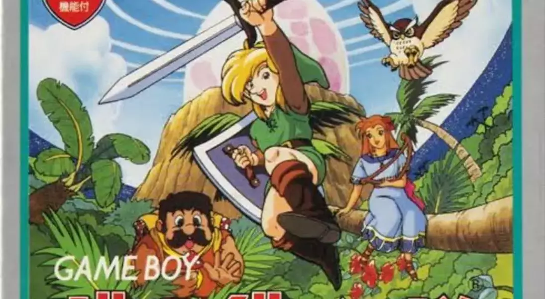
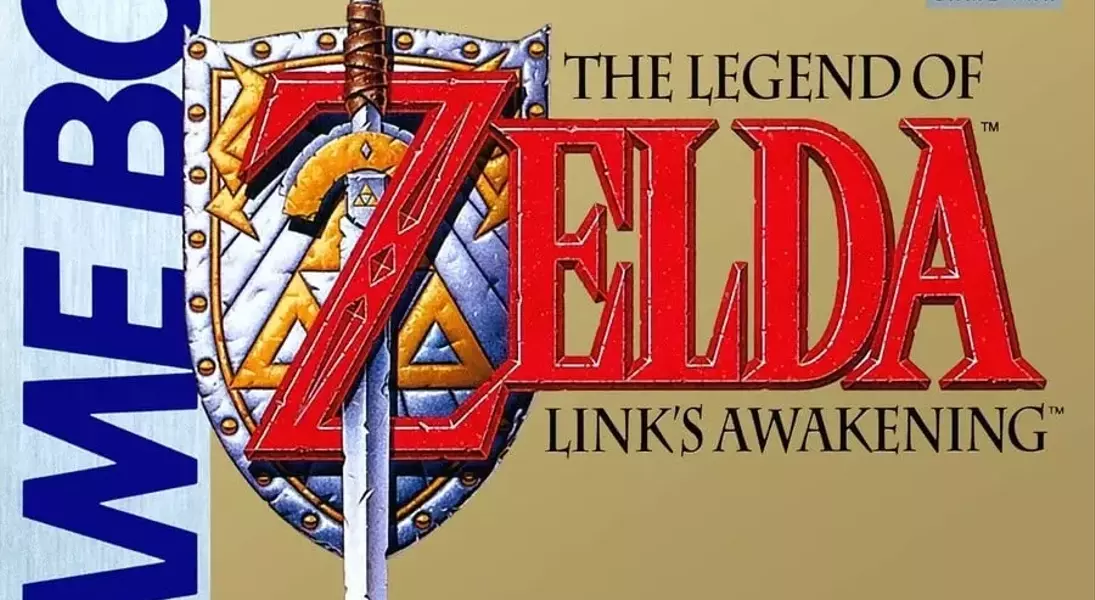
The North American and European release featured a design that aligns with traditional Zelda aesthetics, showcasing the game's title and the emblematic sword-and-shield against a golden-beige backdrop. While some might consider this approach minimalistic, it has undeniably become a recognizable symbol for the series over time. In stark contrast, the Japanese version adopted a more vibrant and narrative-driven artistic style. It presents a dynamic illustration of Link, Marin, and Tarin set against the lush landscape of Koholint Island, with Link actively engaged in battle. This colorful and expressive cover provides a more direct visual preview of the game's characters and setting, distinguishing it significantly from its Western counterpart.
Ultimately, the comparison between these two box art styles highlights differing philosophies in game presentation. The Western cover prioritizes brand recognition and a classic, almost regal simplicity, appealing to established fans. Conversely, the Japanese cover emphasizes immersive artwork that tells a story and introduces characters, aiming to capture the imagination of potential players through visual storytelling. Both approaches offer unique appeals, yet they collectively underscore the enduring legacy and diverse artistic interpretations within The Legend of Zelda universe, inviting reflection on how cultural nuances influence visual marketing in gaming.
