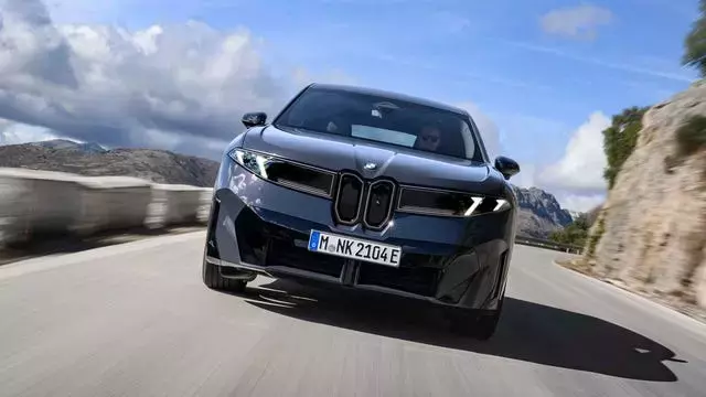


BMW has unveiled a refined version of its recognizable circular emblem, a change that subtly updates the brand's visual identity while maintaining its deep historical roots. This nuanced refresh, which will gradually be incorporated across all BMW models from February, commencing with the 2027 iX3 electric SUV, reflects the automaker's delicate balance between honoring its rich past and embracing a forward-looking design direction. The adjustments are so understated that many enthusiasts might initially overlook them, yet they signify a deliberate evolution in BMW's brand strategy as it ushers in the 'Neue Klasse' era.
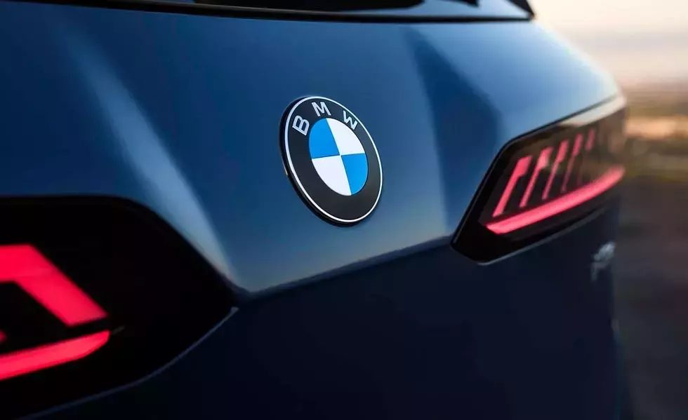
The fundamental structure of the BMW badge remains intact: a black outer ring encircling a central circle divided into four quadrants of alternating blue and white. However, a keen eye will spot the disappearance of the inner chrome ring, replaced by a more contemporary matte finish on the black border. This meticulous attention to detail, while seemingly minor, represents countless hours of graphic design work aimed at modernizing the emblem without alienating its loyal fanbase. Such a delicate redesign underscores the significant reverence for a symbol that has been an integral part of BMW's identity for over a century.
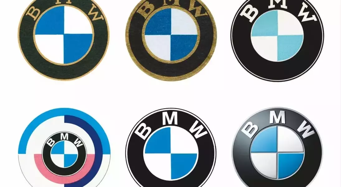
The origins of BMW's distinguished roundel trace back more than 100 years, born from the consolidation of two aeronautical engineering firms in the early 1920s. Initially, the logo was linked to Rapp Motorenwerke, featuring a horse's head. It later evolved to incorporate the light blue and white checkered pattern, a direct homage to the official Bavarian flag and the coat of arms of the House of Wittelsbach. Despite a popular misconception, perpetuated by an early advertising campaign, that the blue and white elements symbolized a rotating aircraft propeller, the true inspiration lies in heraldry, not aviation. While the company did indeed produce inline-six engines for aircraft in its nascent years, the design's core meaning is rooted in Bavarian history. Over the decades, minor alterations have been made, such as the transition from gold lettering in earlier versions, yet the fundamental elements have endured since 1953.
The M Performance division also has its distinct badge, which is slated for its own subtle revision. Given the conservative nature of the latest main BMW logo update, it's anticipated that the M badge's modifications will similarly be iterative, reflecting a cautious approach to brand consistency. This contrasts with BMW's past strategies, where 'M' badging was sometimes liberally applied to models like the X1, potentially diluting its exclusivity. The current measured approach signifies a more refined brand direction.
BMW's design philosophy has recently undergone a period of intense scrutiny, with models like the contemporary M3 attracting diverse opinions. The forthcoming Neue Klasse design language, however, suggests a return to a design ethos celebrated in iconic models such as the E39 M5, E46 M3, and E31 850. With this subtly updated logo, BMW's design teams appear to be signaling an understanding that less can often be more impactful. This seemingly minor shift in branding could herald a significant turning point for the automaker, reinforcing its heritage while propelling it into a new era of automotive design and innovation.
