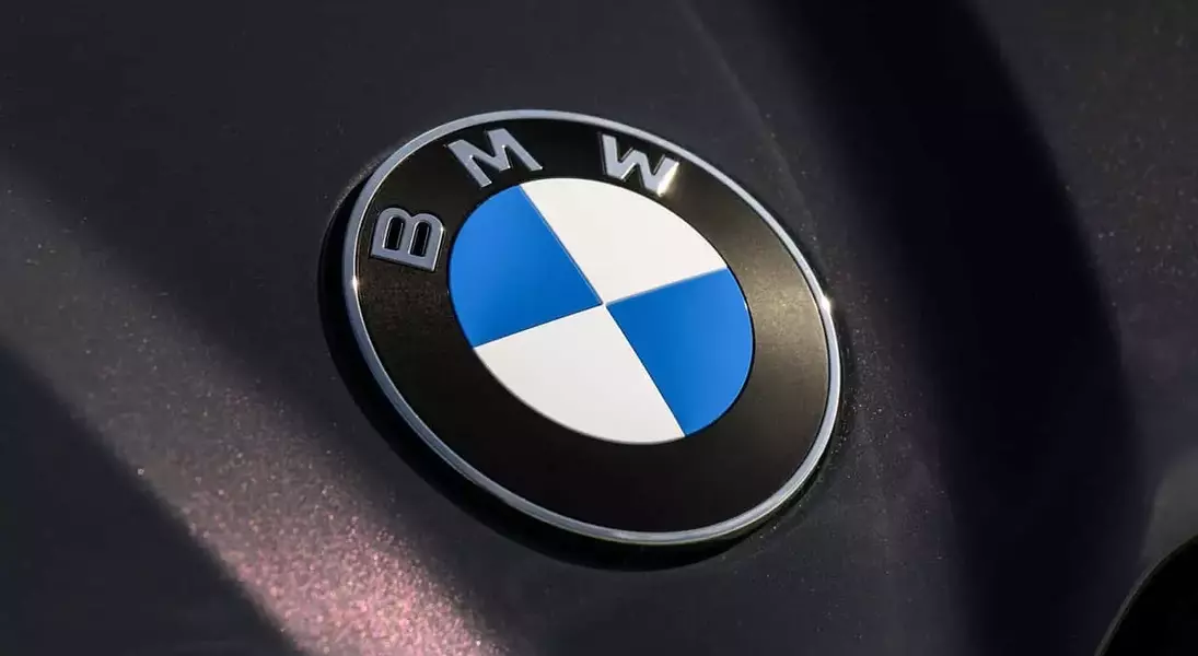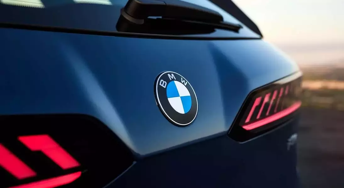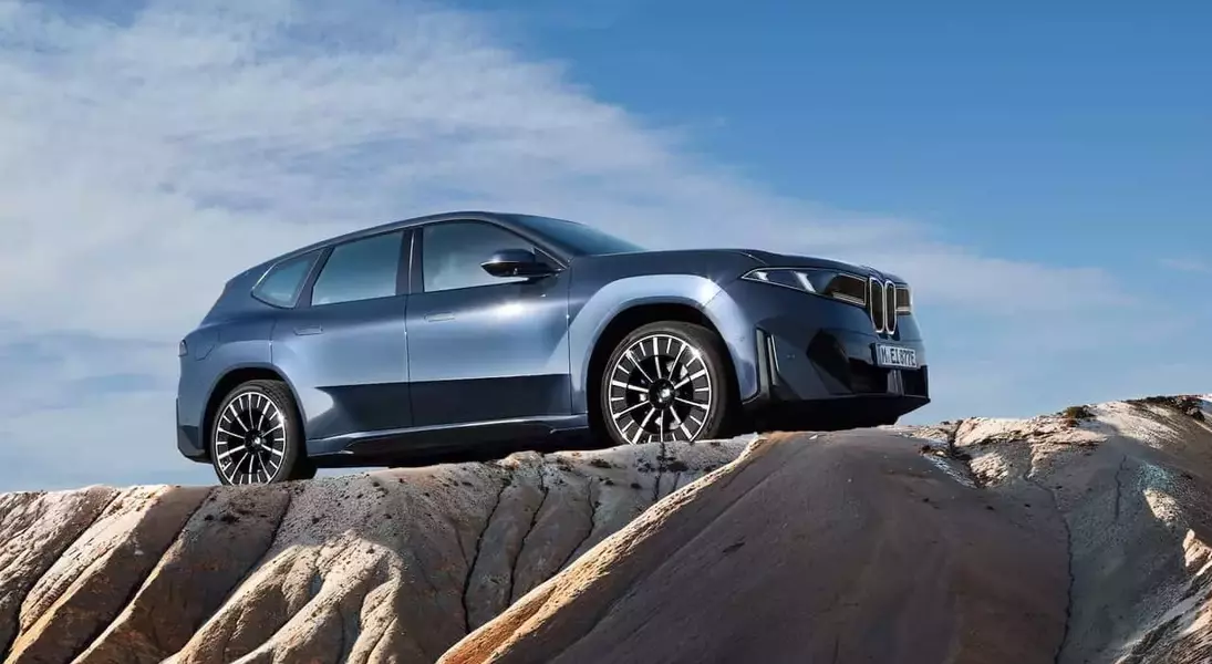


BMW is implementing a refined version of its iconic circular emblem across all vehicle lines, beginning in the upcoming month. This updated insignia, which initially debuted on the iX3, introduces subtle yet noticeable modifications to the brand's visual identity. The company is also extending this design refresh to its performance-oriented M division, ensuring a unified aesthetic across its diverse portfolio.
The Subtle Refinement of BMW's Iconic Emblem
BMW is gradually introducing a refreshed version of its classic circular logo, known as the 'roundel,' which will soon adorn every model in its lineup. This subtle yet significant design update was first showcased on the iX3 and is characterized by meticulous changes aimed at modernizing the brand's image while retaining its historical essence. The alterations, though minor, are part of a broader strategy to refine BMW's visual presentation across its diverse vehicle range, emphasizing precision and contemporary aesthetics in automotive branding.
The key modifications to the BMW roundel involve a more streamlined and contemporary look. Specifically, the updated design removes the internal chrome ring, contributing to a flatter and more two-dimensional appearance. Oliver Heilmer, BMW's design head, highlighted that these changes are not drastic overhauls but rather precise refinements. He explained that the aim was to preserve the brand's rich heritage while enhancing the logo's clarity and modern appeal. The new emblem also features refined lettering with a shiny pattern, reminiscent of high-end watch craftsmanship, and white surfaces that are now positioned closer to the outer ring. This thoughtful evolution ensures that the logo, despite its simplified look, maintains a tactile quality and a sense of premium craftsmanship, aligning with BMW's reputation for sophisticated engineering and design.
Expanding the New Visual Identity to BMW M Models
In conjunction with the widespread adoption of the refreshed corporate logo, BMW is also extending this visual evolution to its high-performance M division. Enthusiasts and consumers can anticipate seeing an updated BMW M logo on vehicles starting in February. While the specifics of the M logo's changes have not been fully detailed, it is expected to mirror the subtle and refined approach taken with the main BMW roundel, ensuring a cohesive brand image across all segments of the company's offerings.
This strategic update for the M logo follows the philosophy of understated modernization applied to the primary BMW emblem. Given the previous redesigns in 2020 and a special black-and-white logo for elite models in 2017, BMW has a history of evolving its brand marks carefully. The upcoming M logo revision is likely to incorporate similar principles, such as a flatter design and enhanced precision in detailing, to harmonize with the overall brand refresh. This ensures that the distinct identity of the M performance vehicles remains prominent, yet integrated within the contemporary aesthetic direction of the broader BMW brand, reflecting a continuous commitment to innovative design and brand consistency.
