Nintendo recently offered an exclusive glimpse into the creative process behind the revamped visuals of 'Ocarina of Time' for the Switch 2, sharing insights from their 'Ask the Developer' interviews. The development team faced the intriguing challenge of modernizing the game's aesthetics for a new console while faithfully retaining the distinctive atmosphere and character of the original. This delicate balance was guided by a vision to blend enhanced realism with the classic title's unique, somewhat dark and whimsical charm, ensuring that both long-time fans and new players would appreciate the updated experience. The candid disclosures included initial concept sketches that illustrate the artistic journey from abstract ideas to the final in-game models, providing a rare peek into the meticulous effort involved in such a beloved reinterpretation. The team's commitment to honoring the game's legacy was evident in their approach to character designs and environmental layouts, all while leveraging the advanced capabilities of the Switch 2 hardware.
Further discussions from these interviews touched upon the technical decisions influencing the game's presentation, notably the choice of upscaling technology. The use of SMAA instead of DLSS for anti-aliasing and upscaling sparked considerable debate within the gaming community. Despite some initial concerns and comparisons to other contemporary titles, the overall visual impact of 'Ocarina of Time' on the Switch 2 has been largely praised. The art direction emphasized a "puppet-show feel" and the "analogue feel of practical effects films" to deepen the immersion, making the fantasy worlds and their inhabitants feel genuinely tangible. This artistic philosophy underpinned the recreation of familiar characters and iconic locations, ensuring they resonated with their original forms while benefiting from significant graphical enhancements. The shared development insights reveal a thoughtful and intentional process aimed at delivering a visually compelling and nostalgically resonant experience.
Character Evolution: From Concept to Console
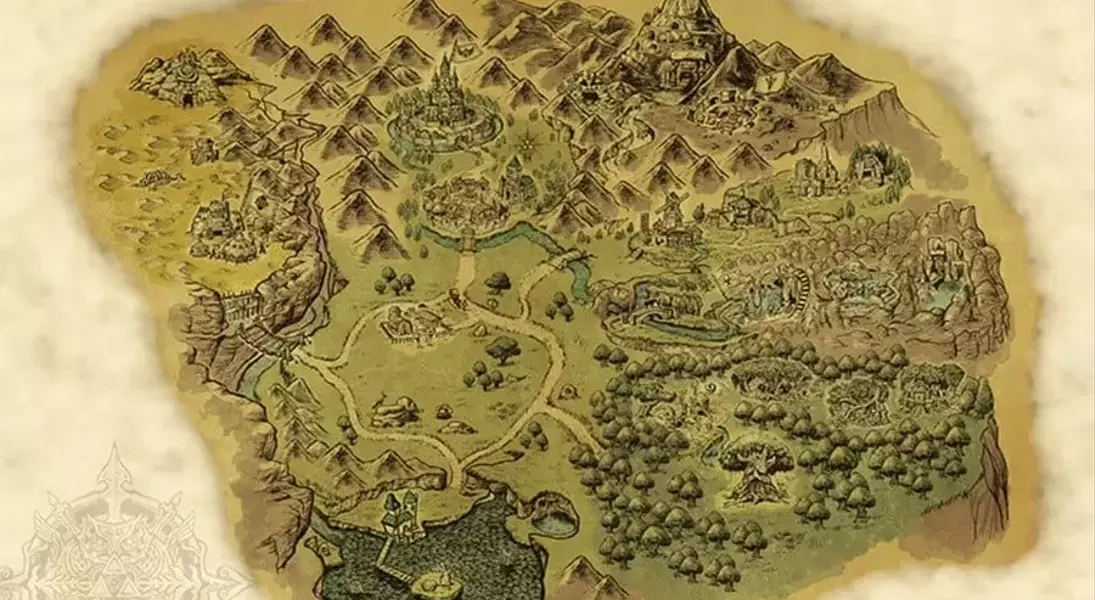
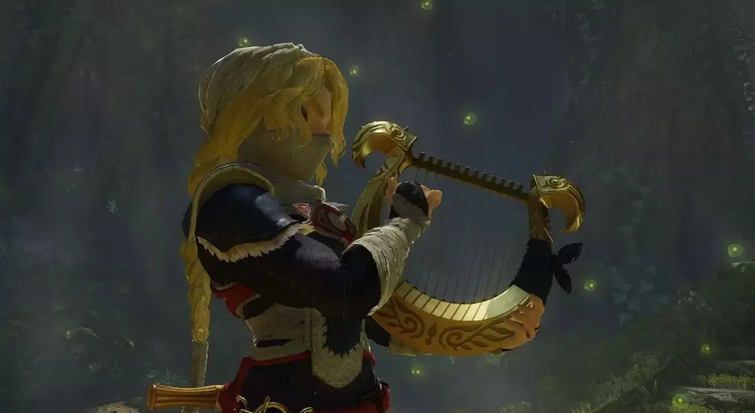
The journey of revitalizing the beloved characters and expansive maps for 'Ocarina of Time' on the Switch 2 involved a careful negotiation between fidelity to the original and modern graphical enhancements. Art Director Aya Shida led the charge, emphasizing the creation of a world where characters felt authentically part of their fantastical surroundings. The challenge lay in harnessing the Switch 2's advanced capabilities for greater realism without losing the distinctive, slightly dark and whimsical charm that defined the N64 classic. This process involved drawing inspiration from diverse sources, such as the tactile nature of practical effects in film and the evocative quality of puppet shows, to imbue the visuals with a convincing sense of presence. The goal was to update the game's visual language while preserving its core identity, ensuring that every character and setting evoked a familiar yet refreshed sense of wonder.
The development team meticulously worked on ensuring that characters like Child Link were immediately recognizable, while also introducing subtle yet significant costume enhancements and intricate details that aligned with the new graphical fidelity. This dual objective of preserving a "familiar presence" alongside adding "designs unique to this game" guided the artistic choices. Similarly, for the game's iconic maps, Director HokWai Ng stressed the importance of maintaining the essence and interconnectedness of each location. To achieve this, an artist from the original N64 project was brought back to conceptualize new maps, ensuring continuity and reverence for the source material. These behind-the-scenes glimpses into initial design sketches showcase the iterative and thoughtful approach to development, highlighting how early conceptualizations paved the way for the game's current, highly acclaimed visual style, which has steadily won over critics and players alike.
Technical Choices and Visual Impact
The technical underpinnings of 'Ocarina of Time's' visual presentation on the Switch 2 reveal a deliberate strategy, particularly concerning its upscaling and anti-aliasing technologies. Nintendo opted for SMAA over Nvidia's more advanced DLSS, a decision that has sparked considerable discussion among technical enthusiasts and the gaming community. This choice, also seen in other Nintendo titles like 'Donkey Kong Bananza,' indicates a potential preference for solutions that are perhaps easier to integrate or align better with the console's architectural design, even if they might not offer the absolute peak in graphical fidelity compared to alternatives. Despite this, the game's visual quality has generally been well-received, suggesting that the artistic direction and optimization efforts have largely mitigated any perceived drawbacks from the technological choice, delivering a polished and engaging experience that stands on its own merits.
While the absence of DLSS generated some initial disappointment, especially after its highly anticipated reveal for the console, the overall finished product of 'Ocarina of Time' on the Switch 2 does not appear to have suffered a significant negative impact. The game's visual style, a result of combining improved realism with the original's characteristic charm, showcases a successful blend of old and new. The design sketches and developmental philosophies shared by the team underscore a commitment to artistic integrity and player immersion. Although specific technical trade-offs were made, such as the choice of upscaling technology, the game's vibrant world and meticulously updated characters resonate strongly with players, demonstrating that thoughtful art direction and comprehensive optimization can often outweigh reliance on a single cutting-edge technology. The current visual state of the game is a testament to this balanced approach, proving that an integrated vision is paramount to a successful modern reimagining.