

The minimalist trend of "sad beige" interiors is officially giving way to a more exuberant and colorful aesthetic in 2026. This shift marks a return to bold and expressive color palettes, reflecting a growing desire for warmth, personality, and visual interest within living spaces. Interior designers are forecasting a diverse array of shades to dominate the scene, from grounding earth tones to lively, desaturated brights, encouraging homeowners to move beyond monochromatic schemes and embrace a richer spectrum of colors. This upcoming year promises a more dynamic and engaging approach to home decoration, where individual expression through color takes precedence.
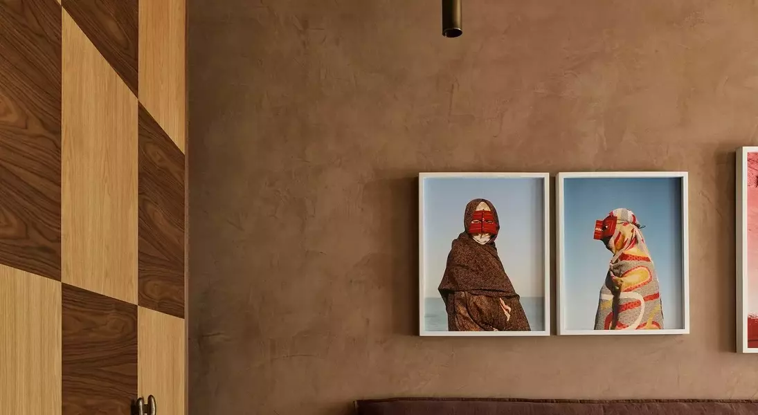
Among the key colors poised to redefine home interiors, earthy umber stands out. David Flack of Melbourne's Flack Studio, renowned for designing Troye Sivan's residence, anticipates a surge in brown and umber-based hues. He describes these as "warm, muddy neutrals" that provide a comforting embrace, ideal for expansive areas, and capable of creating a cohesive flow throughout a home with complementary shades. These darker tones are particularly effective in establishing a sense of grounding and adding significant visual weight to a room, offering a sophisticated alternative to the lighter, more subdued palettes of recent years.
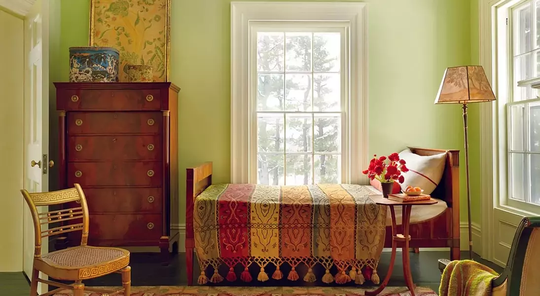
Another emerging favorite is pistachio-chartreuse, a color championed by Marie Trohman and Ashley Drost of Los Angeles-based Proem Studio, known for their work on Emma Chamberlain’s home. This vibrant green, distinct from bolder "brat green," offers a natural and earthy yet strikingly playful appeal. Trohman notes its immediate eye-catching quality and its ability to add a fun element without overwhelming a space. Designers suggest incorporating this shade through subtle accents like a rug with a chartreuse border or through lively throw pillows, making it an approachable option for those hesitant about bold color commitments.
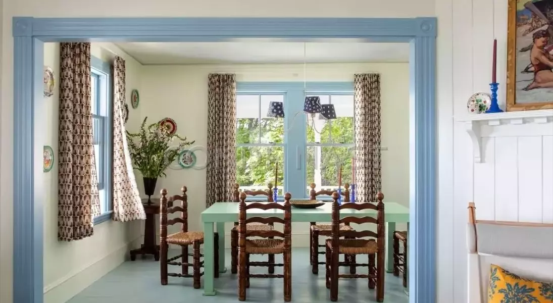
For a serene yet captivating touch, desaturated sky blue is gaining traction. Marie Trohman is integrating this calming shade into her own renovation projects, highlighting its soft allure and its remarkable versatility. This blue harmonizes beautifully with the neutral tones that have characterized homes over the past few years, providing a gentle contrast that is both intriguing and adaptable. Furthermore, its compatibility with various wood tones makes it an excellent choice for creating a balanced and inviting atmosphere.
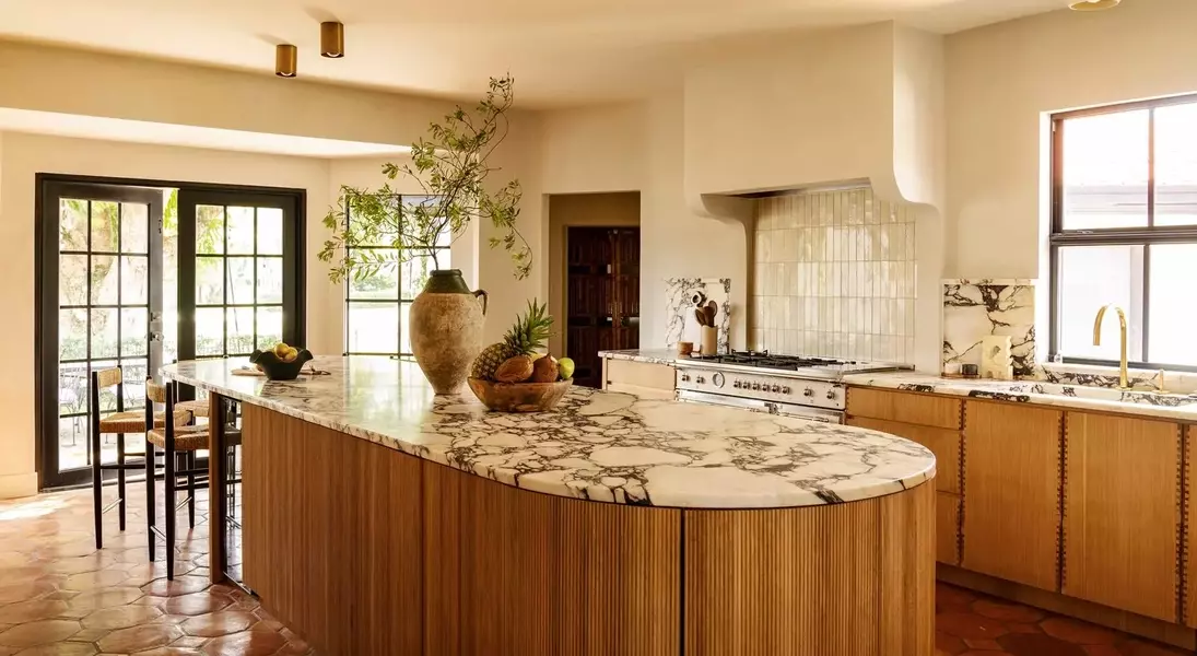
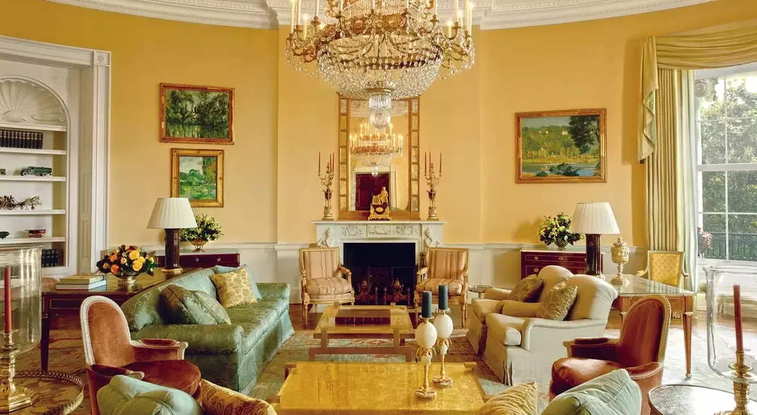
Ochre, a yellowish-orange hue, is another earthy tone predicted to be popular by Austin-based interior designer Annie Downing. She appreciates its ability to impart a "sunbaked, lived-in quality" to a room, effortlessly blending with both antique and modern furnishings. This warm, rich color adds depth and character, contributing to an overall sense of comfort and timeless elegance. Downing's emphasis on ochre underscores a broader trend towards embracing colors that evoke a connection to nature and history.
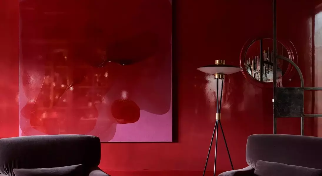
Red, particularly in its brighter and burgundy variations, is also making a significant comeback. Several designers express a fondness for these passionate hues, forecasting their widespread appearance in interiors. Annie Downing specifically favors a "bright, confident red," anticipating a general increase in daring color choices this year. This suggests a departure from cautious selections, encouraging homeowners to infuse more personality and boldness into their decorative schemes, making their living spaces truly reflective of their individual tastes.
Finally, lemon-vanilla emerges as a refined approach to using white, offering a softer alternative that beautifully complements both vibrant and darker shades. David Flack is particularly drawn to a light yellow with a 1950s machine-like quality, appreciating its subtle yet unexpected undertones. He values neutrals that possess a hint of color, such as a pink-tinged white, a lemon-infused white, or even a muted brown-white. This trend indicates a preference for nuanced neutrals that add complexity and warmth, subtly enhancing the overall color narrative of a room while maintaining a sense of refined elegance.
